
How to Add a Dark Mode Toggle to Ghost Using Code Injection
If you are using the Edition theme for Ghost, you might have noticed it lacks a native Dark Mode toggle. While Ghost handles themes elegantly, sometimes you want to give your users the choice to save their retinas late at night without having to download, edit, and re-upload the entire theme .hbs files.
Ghost Blog / CMS Hacks
In this tutorial, I'll show you how to "hack" a persistent Dark Mode toggle into your Ghost site using only the Code Injection feature. This means no FTP access required and no risk of breaking your theme files during updates. You can very likely apply the same to other themes that do not have it builtin but always be careful, as I used a combo of vibe-coding with AI and my own elbow grease, examining the dev console in Firefox.
The Strategy
We are going to use a simple three-part strategy:
- CSS Variables: We will define a standard set of color variables (backgrounds, text, borders).
- The Class Toggle: We will use a simple CSS class (
.dark-mode) applied to the<html>tag to overwrite those variables when active. - Local Storage: We will use a tiny bit of JavaScript to remember the user's preference so they don't have to click the button every time they change pages.
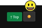
At the end, this should show up as a little toggle on the bottom left of the screen. It's hidden in mobile mode and/or small screens.
Step 1: Site Header Injection
First, we need to set up the styles. Navigate to Settings -> Code Injection and look at the Site Header section.
We are going to add a <style> block that does three things:
- Sets up the default colors.
- Overrides them when
html.dark-modeis active. - Fixes the "You might also like" section (which is often stubborn).
- Positions the toggle button in the bottom-left corner (next to the "Top" button if you have one).
Copy and paste this into your Site Header:
<style>
    /* =================================================================
       DARK MODE VARIABLES
       ================================================================= */

    /* 1. Default (Light) - ensuring defaults are explicit */
    :root {
        --dm-bg: #ffffff;
        --dm-text: #15171a;
        --dm-secondary: #738a94;
        --dm-border: #e1e1e1;
        --dm-nav-bg: #f9f9f9;
    }

    /* 2. Dark Mode Overrides */
    html.dark-mode {
        /* Core Ghost Color Overrides */
        --color-base: #e0e0e0;
        --color-secondary-text: #9aa0a6;
        --color-border: #333333;
        --color-bg: #111111;

        /* Internal mapping for custom elements */
        --dm-bg: #111111;
        --dm-text: #e0e0e0;
        --dm-secondary: #9aa0a6;
        --dm-border: #333333;
        --dm-nav-bg: #1a1a1a;

        /* Update Ghost variables */
        --ghost-accent-bg: #1a1a1a !important;
        --ghost-text-color: #e0e0e0 !important;
    }

    /* 3. Apply Dark Mode Styles to Main Containers */
    html.dark-mode body,
    html.dark-mode .gh-head,
    html.dark-mode .gh-foot {
        background-color: var(--dm-bg) !important;
        color: var(--dm-text) !important;
    }

    /* --- THE "YOU MIGHT ALSO LIKE" FIX --- */
    /* This section (related-wrapper) often stays white by default.
       We force it (and its children) to accept the dark background. */
    html.dark-mode .gh-readmore,
    html.dark-mode .related-wrapper,
    html.dark-mode .gh-readmore article,
    html.dark-mode .gh-card {
        background-color: var(--dm-bg) !important;
        color: var(--dm-text) !important;
    }

    /* Make card internals transparent so the background shows through */
    html.dark-mode .gh-card-wrapper,
    html.dark-mode .gh-card-content {
        background-color: transparent !important;
    }

    /* Force titles to be white */
    html.dark-mode h1, html.dark-mode h2, html.dark-mode h3,
    html.dark-mode h4, html.dark-mode h5, html.dark-mode h6,
    html.dark-mode .related-title,
    html.dark-mode .gh-header-title {
        color: #ffffff !important;
    }

    html.dark-mode p,
    html.dark-mode li {
        color: var(--dm-text);
    }

    /* 4. The Toggle Button Styling */
    #dark-mode-toggle {
        position: fixed;
        bottom: 30px;
        left: 100px; /* Adjust this to sit next to your 'Top' button */
        z-index: 9999;
        background: var(--dm-nav-bg);
        color: var(--dm-text);
        border: 1px solid var(--dm-border);
        padding: 0.6em 1em;
        border-radius: 4px;
        font-size: 0.9em;
        cursor: pointer;
        transition: all 0.3s ease;
        box-shadow: 0 2px 5px rgba(0,0,0,0.1);
        display: flex;
        align-items: center;
    }

    html.dark-mode #dark-mode-toggle {
        background: #333;
        color: #ffeb3b; /* Yellow sun icon when active */
        border-color: #555;
    }

    #dark-mode-toggle:hover {
        transform: translateY(-2px);
        box-shadow: 0 4px 8px rgba(0,0,0,0.2);
    }

    /* Hide on mobile to save screen space */
    @media (max-width: 1100px) {
        #dark-mode-toggle {
            display: none;
        }
    }
</style>
Step 2: Site Footer Injection
Now we need the functionality. This script does a few checks when the page loads:
- Does the user already have a preference saved in
localStorage? - If not, does their computer system prefer dark mode?
- If either is true, turn on Dark Mode immediately.
Paste this into your Site Footer:
<script>
document.addEventListener('DOMContentLoaded', function () {

    // 1. Create the Toggle Button
    const dmToggle = document.createElement("button");
    dmToggle.id = 'dark-mode-toggle';
    dmToggle.setAttribute("aria-label", "Toggle Dark Mode");
    dmToggle.innerHTML = '<span>🌙</span>'; // Default Moon Icon
    document.body.appendChild(dmToggle);

    // 2. Define Toggle Logic
    const htmlEl = document.documentElement;
    const storageKey = 'ghost-theme-preference';

    const setTheme = (theme) => {
        if (theme === 'dark') {
            htmlEl.classList.add('dark-mode');
            dmToggle.innerHTML = '<span>☀️</span>'; // Switch to Sun
            localStorage.setItem(storageKey, 'dark');
        } else {
            htmlEl.classList.remove('dark-mode');
            dmToggle.innerHTML = '<span>🌙</span>'; // Switch to Moon
            localStorage.setItem(storageKey, 'light');
        }
    };

    // 3. Check Preferences on Load
    // Priority: LocalStorage > System Preference > Default Light
    const savedTheme = localStorage.getItem(storageKey);
    const systemDark = window.matchMedia('(prefers-color-scheme: dark)').matches;

    if (savedTheme === 'dark' || (!savedTheme && systemDark)) {
        setTheme('dark');
    }

    // 4. Click Listener
    dmToggle.addEventListener('click', () => {
        if (htmlEl.classList.contains('dark-mode')) {
            setTheme('light');
        } else {
            setTheme('dark');
        }
    });
});
</script>
The "Gotcha" Solved
One of the trickiest parts of hacking the Edition theme is the "You might also like" section at the bottom of posts. It uses a container class called .related-wrapper (or .gh-readmore in older versions) that often ignores global background changes, resulting in white text on a white background.
In the CSS above, you'll notice I included a "Nuclear Fix" block:
html.dark-mode .related-wrapper,
html.dark-mode .related-title {
    background-color: var(--dm-bg) !important;
    color: #ffffff !important;
}
This specifically targets that stubborn container and forces it to comply with our dark theme.
Summary
That's it! You now have a persistent Dark Mode toggle that sits quietly in the bottom left of your screen, remembers your users' preferences, and doesn't require editing a single theme file.
Check out how to lock your environment down and keep your self-hosted website/blog/CMS secure with my Practical Cybersecurity Guide.
🤔Looking for a VPS to host with?
Core Lab recommends Web Hosting Canada!


Member discussion